Color Studies
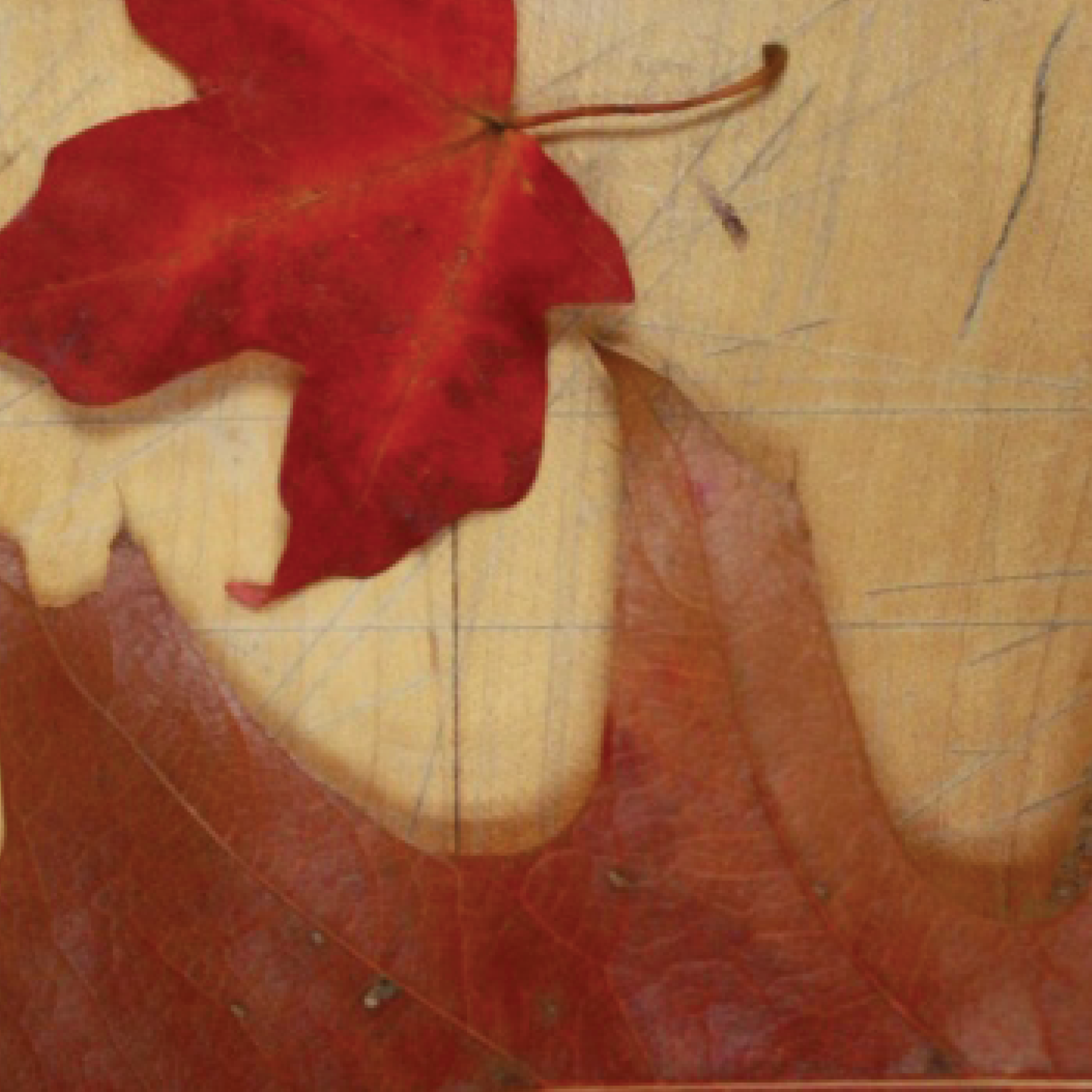
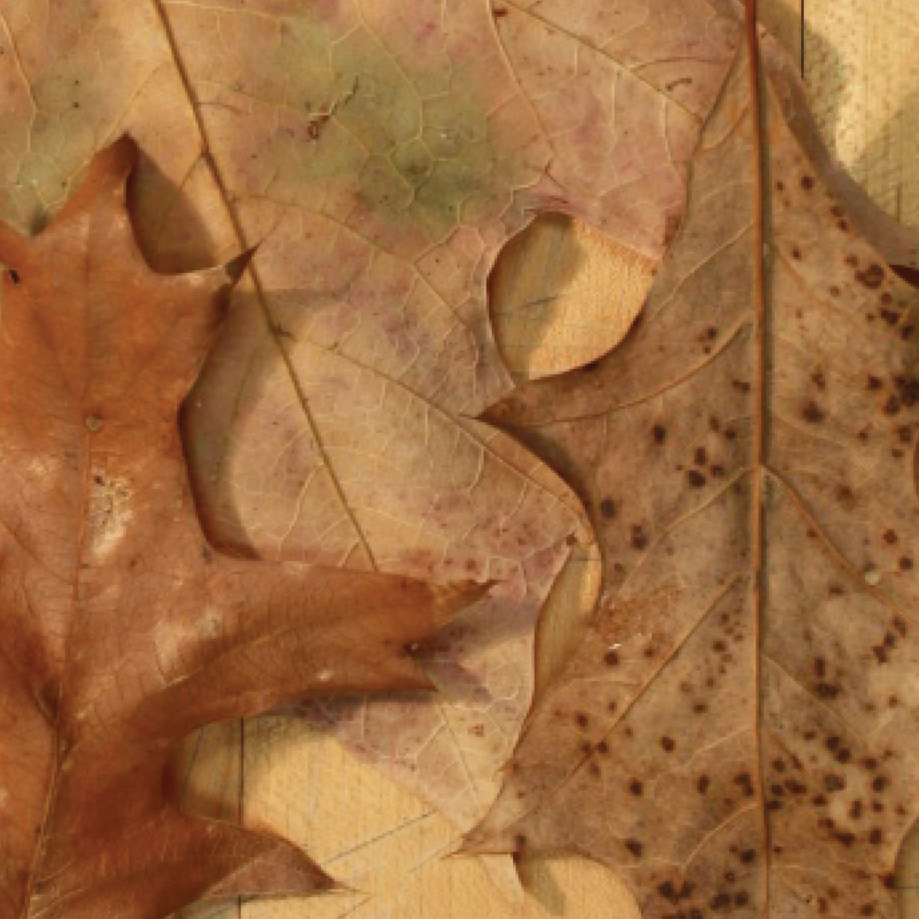
During my second year at CMU I studied under Mark Mentzer in his Color and Communication class. Here I was able to apply my basic knowledge of color theory and learn the principles and terminology behind the more visceral feelings that color evokes. Below is a study of fall leaves and their color transition period and how they relate to each other (dull vs. vibrant, different hues, etc.)
Skills
Layout + Composition + Color research + Collage + Moodboards + Branding + Illustrator + Photoshop
Color Squares- Finding Color Contrast Relationships
This study is an exercise that trained our eyes to understand when a color is being pushed back or brought forward in a composition. It also explored various color principles such as contrast of hue, saturation, intensity, extension, and simultaneous contrast.
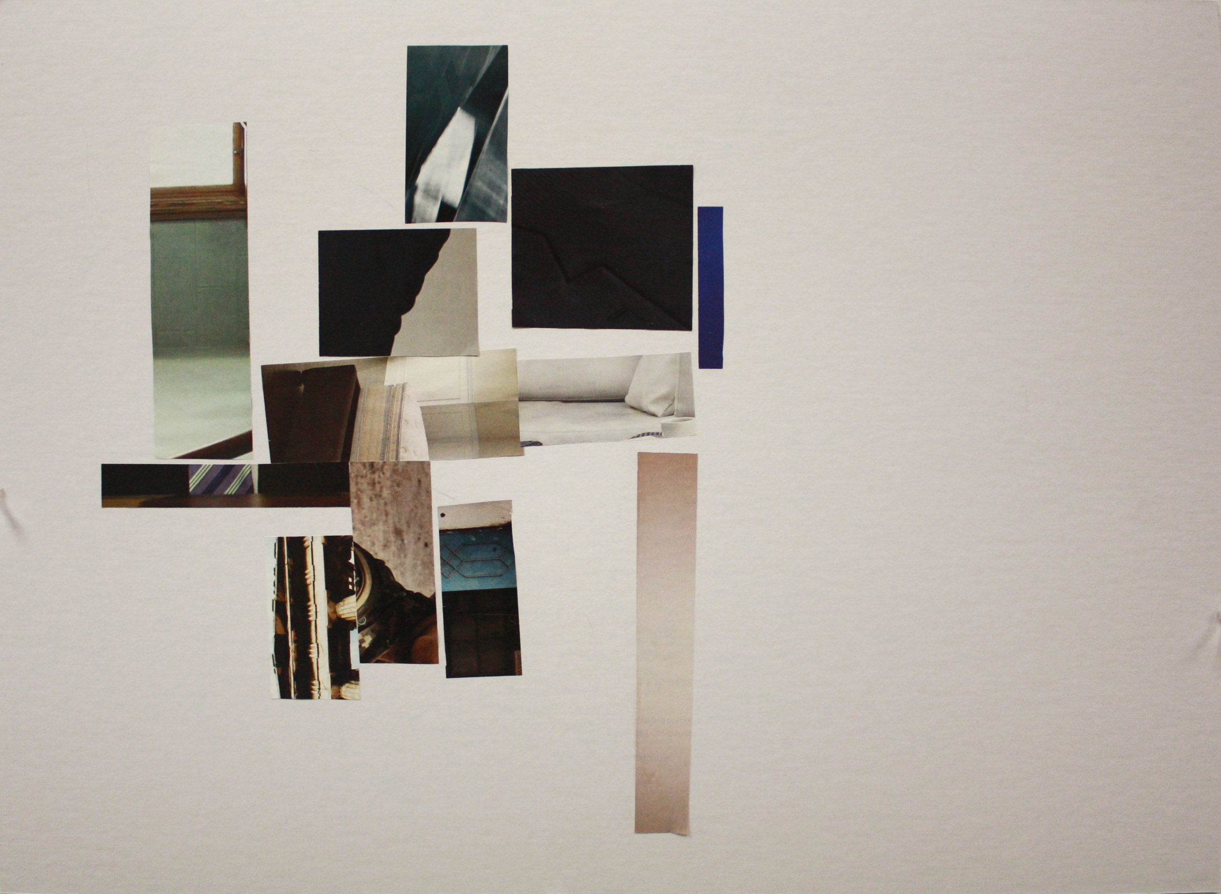
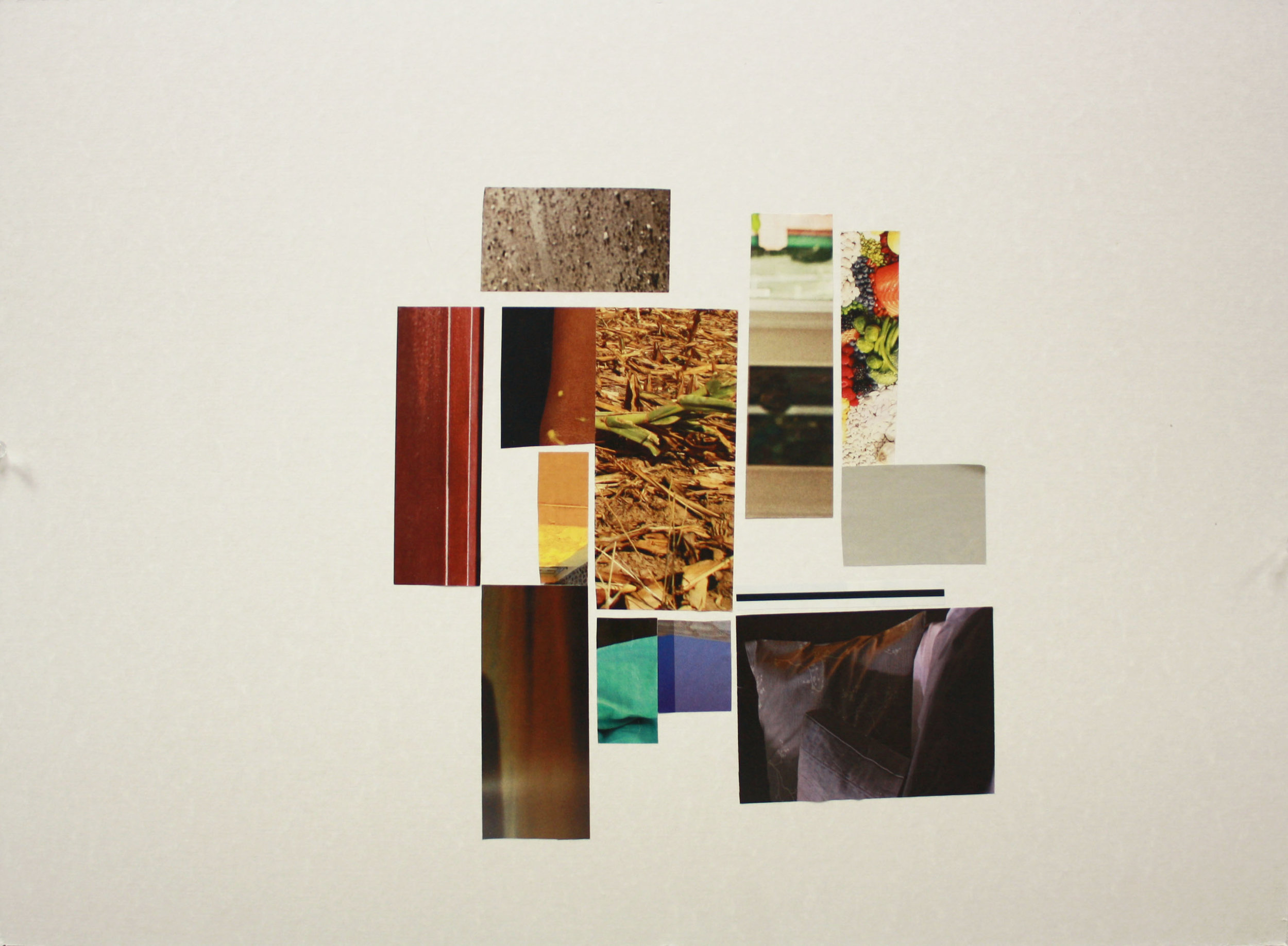
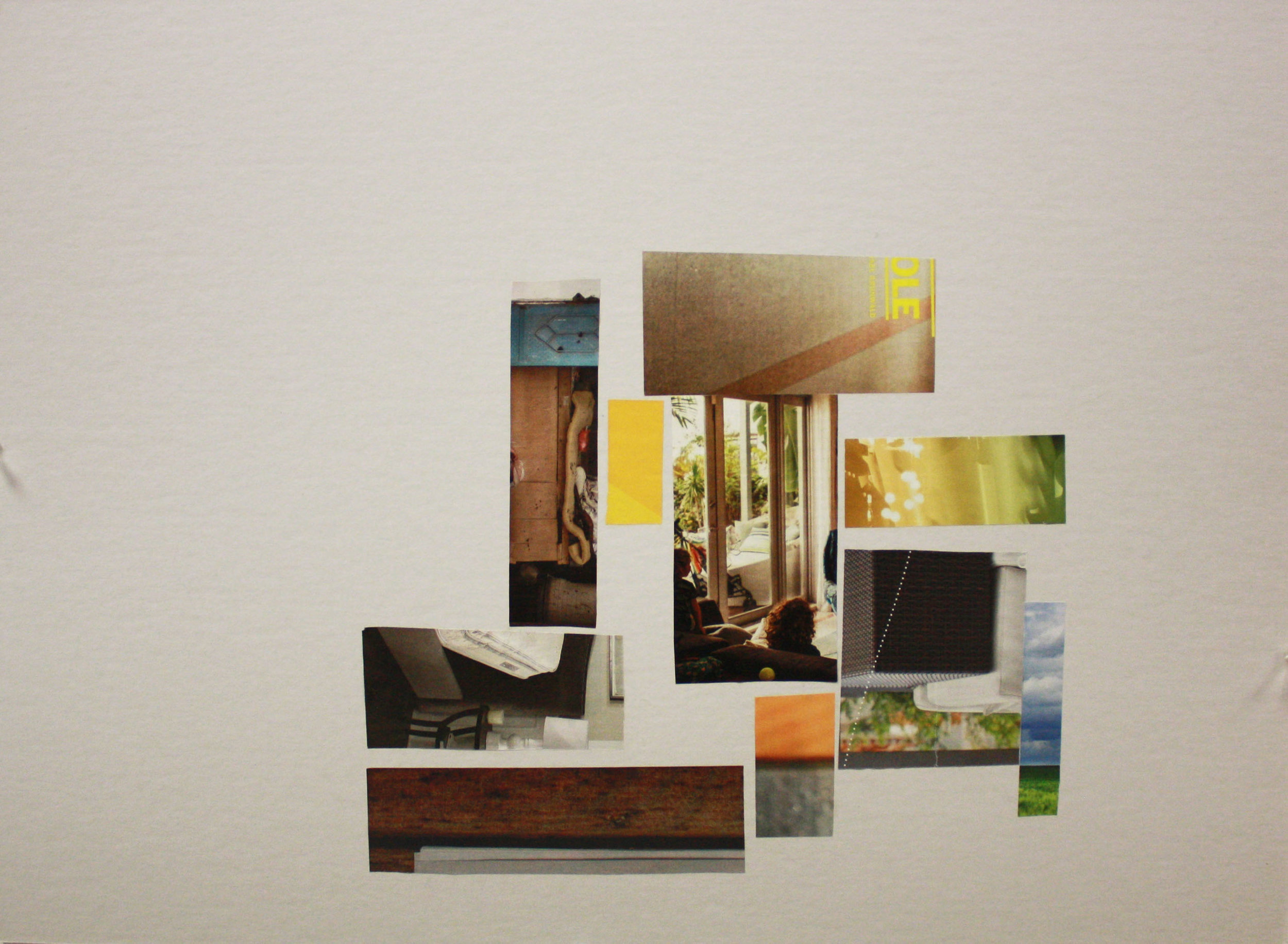
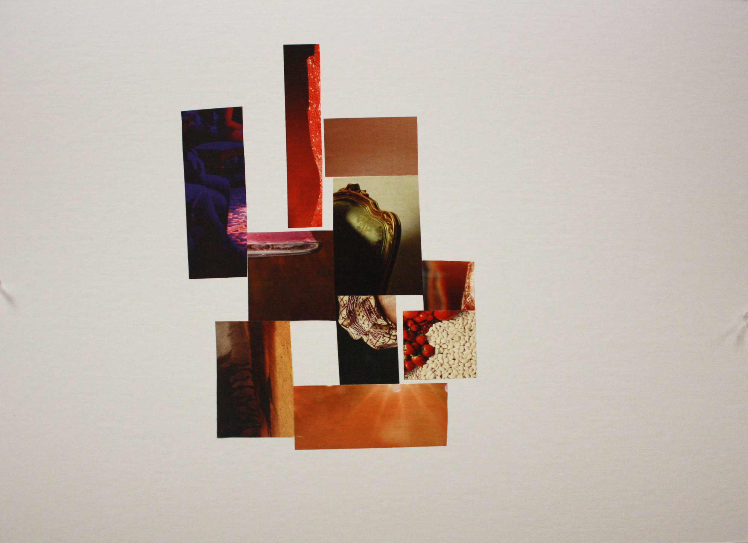
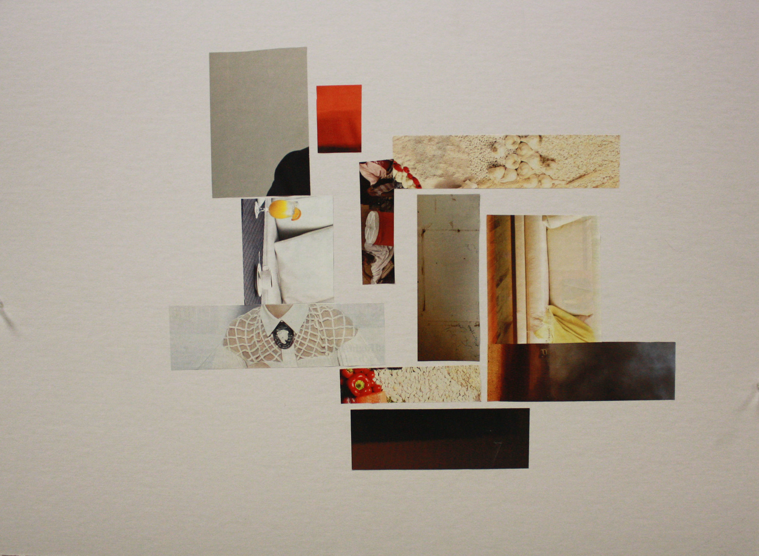
Mood Boards- School of Music & School of Architecture (from top to bottom)
Within the College of Fine Arts at CMU there are 5 schools: Design, Art, Architecture, Drama, and Music. During this study I explored several different magazines and compiled sections of images that I felt fell into the color spectrum of each school's identity.
Painting with Color
Several weeks into the course we were encouraged to experiment with colored paints. During this exercise, I created three different color compositions and cropped each composition multiple times to find different color relationships.
Petals Flower Shop Project
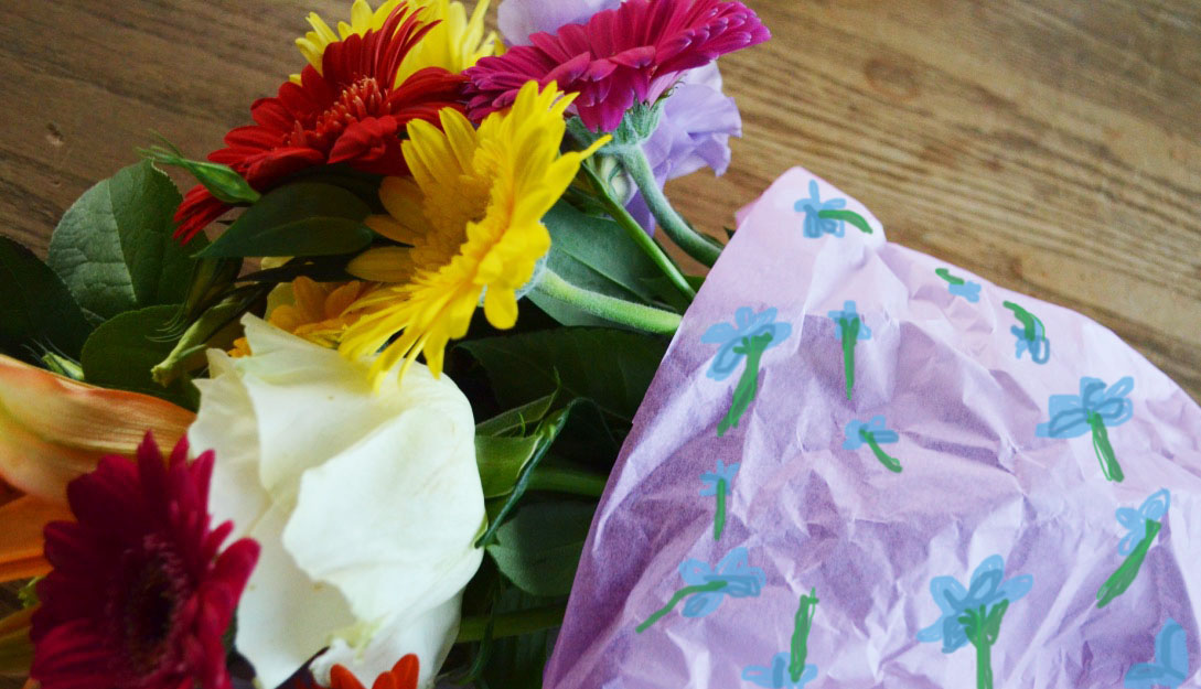
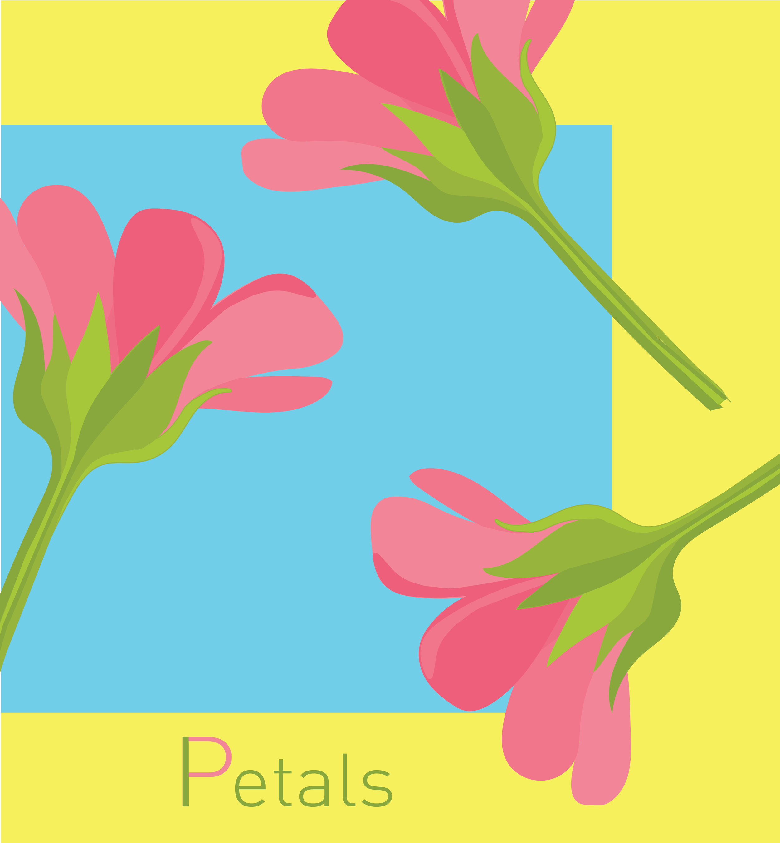
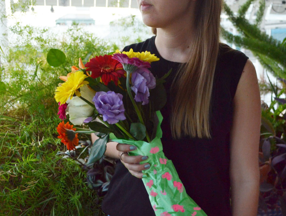
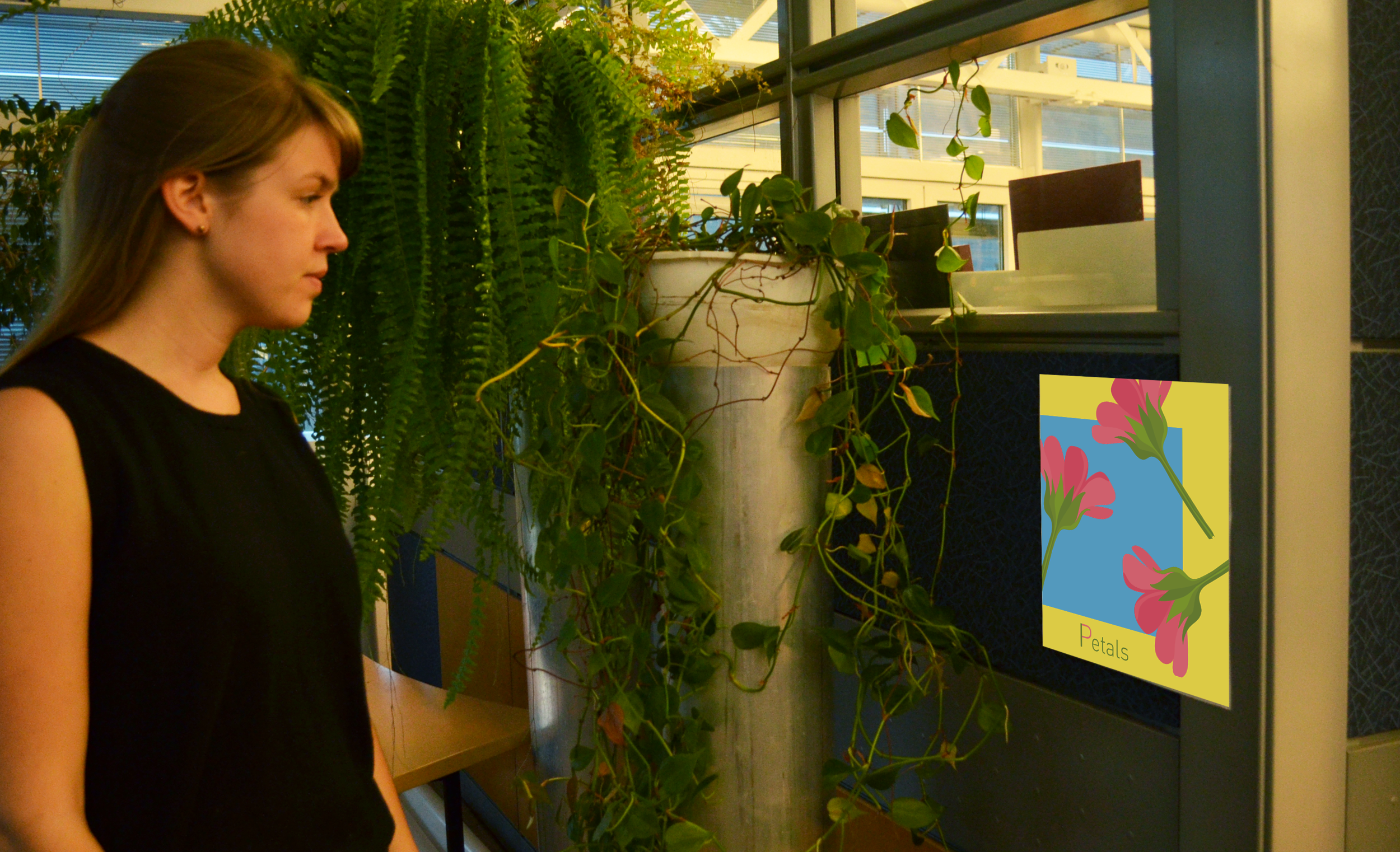
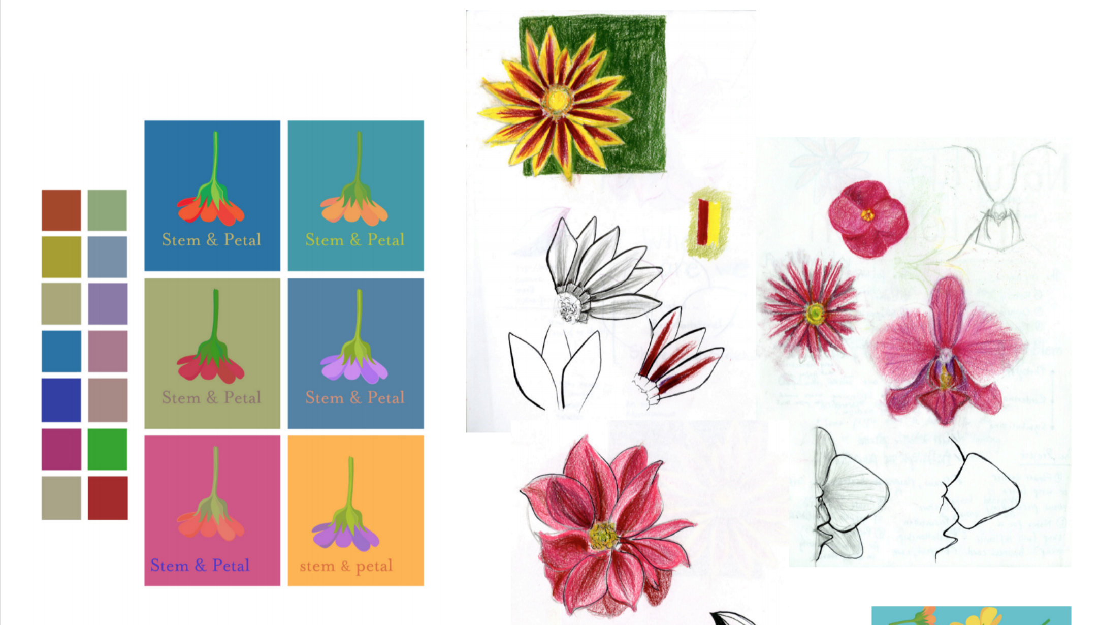
Petals was one of the final projects I completed in this class. The focus of the project was to explore unity of a theme through color that could serve as a platform for a particular brand, in this case the brand is a hypothetical flower shop. From left to right and top to bottom I have created a poster with an in-context photo, a card, a "flower of the month" card that gives background on the flower on the back and an image of the flower on the front, and four patterns for the wraps that go around the flower upon purchase with their in-context photos.
Experimenting with print and pattern making
An accumulation of my work throughout the Color + Communication course.

